Blog
Why Shopify One-Page Checkouts Increase Store Conversions
Have you heard about Shopify's new one-page checkout? Get better conversion and more sales with this great new update to your checkout. Read more!

Have you heard about Shopify's new one-page checkout? Get better conversion and more sales with this great new update to your checkout. Read more!


November 7th, 2023
Have you heard about Shopify's new one-page checkout? Get better conversion and more sales with this great new update to your checkout. Read more!
Online shoppers want to checkout quickly and easily when they buy things. They know they have to give stores lots of details to finalize the sale, so it needs to be easy. If the checkout process is too long or complicated, they might not want to finish buying. It's better for stores to have a simple checkout page. This makes shoppers happy and keeps the buying momentum moving forward.
In any ecommerce store, the checkout process is the final step between browsing and buying. Once customers enter your store's checkout flow, you don't want to impede or confuse them in any way. The easier you make checkout, the better chance you have to capture a sale. This is where a one-page checkout is your secret to increased sales and customer satisfaction. If you're not thinking about implementing a one-page checkout into your ecommerce design, then you should be convinced after reading this blog. If you're a Shopify merchant then don't worry, one-page checkout is already available for your store.
If you want to keep customers converting, then keep it simple. Your buying process shouldn't be a complex wave of pages and buttons, especially at checkout. The more confusing you make your checkout, the higher chance a buyer will get frustrated and leave. Simple is better and you can't make it more simple than a one-page checkout process.
Think of your checkout like a customer driving down a road. If the checkout process has many pages, it feels like stopping at red lights over and over again. It slows down the journey and causes frustration. But with a one-page checkout, it's like driving on an open road with no red lights. Everything the customer needs is on one page. This makes them more likely to finish buying because it's so easy. Providing a consolidated view to the customer removes hesitation and the likelihood of abandoning their cart drops dramatically.
A one-page checkout is a straight shot to the finish line. It makes the buying process quicker and less confusing for customers. It's simple and efficienct. It's no wonder that Shopify has ditched their old three-page checkout and made one-page checkout the default experience.

Since its inception, Shopify has featured a multi-page checkout flow. Customers would previously bounce between multiple pages for address, shipping and payment. As of 2023, that is no longer the case with Shopify's new one-page checkout.
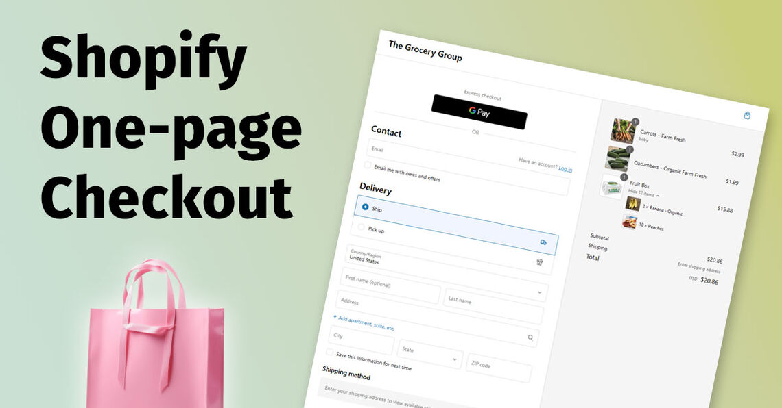
The reimagined checkout consolidates all steps onto one page, ensuring a seamless and effortless purchase journey. By reducing the number of page refreshes, Shopify customers can finalize their transactions more quickly. The one-page checkout is also compatible with Shop Pay so the customer's name and cardholder data can be quickly populated. The checkout page uses a summarizing title, allowing buyers to focus on filling out the next section without being distracted by previous inputs. The result is a clean, easy-to-navigate page.
Some of the features of Shopify's new one-page checkout include:
All required form fields are on one page. All the necessary customer data, contact information, shipping address, shipping method, and payment details are requested at once making checkout faster.
Displays products, pricing, and shipping options. Buyers can review their purchase, details, total cost, shipping timeframes, delivery fees, and company policies, all in one place.
Compatible with Shopify extensibility. The new page is built on Shopify's Checkout Extensibility and gives merchants lots of flexibility. The page is fully compatible with apps and is upgrade-safe.
It's fully customizable. Jump into your theme editor to adjust colors and logos for the checkout page.
The one-page checkout experience is the default method for all plans. You cannot switch back to the three-page checkout experience unless you're on the Shopify Plus plan (Plus will allow the merchant to choose between the different checkout experiences.)
Shopify stores that use the one-page checkout are already seeing increased sales. A recent study revealed that one-page checkouts saw an average increase of 20-30% in conversion. The goal for any merchant is to grow and retain customers and simplifying the checkout is core to a good CRO overhaul (conversion rate optimzation.) Even a small increase in sales means a lot more money for your store. But why does a one-page checkout convert better?
The reasons for such impressive results are rooted in consumer psychology. One-page checkouts provide clarity and convenience. Customers appreciate seeing everything in one glance with no hidden steps. It's clear and saves time. Customers don't have to click through many pages. They don't have to wonder what step is next. They can fill in their information all at once. This keeps them focused on finishing quickly.
It also important to think about the devices most modern customers use to shop. A significant portion of online shopping is conducted on smartphones and tablets. The need for a mobile-friendly checkout process is greater than ever. More people are buying things using their phones so, having a checkout that's easy to use on a small screen is important. Shopify's one-page checkout fits nicely on these screens and makes shopping on a phone much less of a hassle. This eliminates the cumbersome task of clicking through multiple pages on a small screen where the visual real estate is at a premium.

Modern ecommerce is all about convienence and speed. Customers want to buy things quickly without any trouble. Shopify's one-page checkout let's them enter details, choose their payment all in one. It's like walking up to a cashier in a store, paying and leaving without waiting in line.
It also helps reduce mistakes. Customers can see all the information they've entered at once. They can spot and fix any errors right away. It's like filling out a form with all the questions in front of you instead of having to flip through pages.
Implementing a one-page checkout lets customers enjoy shopping more since they don't have to deal with a long, complicated checkout process. They can buy what they want quickly.
The shift toward one-page checkouts is not a fleeting trend, but a strategic improvement in shopping experiences. By respecting your customers' time, reducing friction, and simplifying the process, online retailers that implement a one-page checkout are investing in customer loyalty. Merchants enjoy higher conversion rates and customers become repeat buyers due to the easy checkout experience.
A one-page checkout makes buying things really easy for your customers, especially for those shopping on mobile devices. When customers enjoy using a store's checkout, they are more likely to come back and buy more. As a store owner, now is the time to switch to a one-page checkout to sell more and make your customers happy. It's simple: when shopping is easy, people are more likely to do it more often!
Want to convert your store to a one-page checkout? Contact us today!