Blog
Design Exploration: Ride Sharing Company
Design Exploration: A brand new ride sharing company needs a logo and branding. Let's explore that design.

Design Exploration: A brand new ride sharing company needs a logo and branding. Let's explore that design.


November 15th, 2021
Design Exploration: A brand new ride sharing company needs a logo and branding. Let's explore that design.
A new ride sharing company is starting up and needs a logo, website and some branding. The Sunrise Integration design team has taken up the challenge to create something that matches the new company's desired brand and their corporate positioning for this space. Let's explore the results.
The Logo
The first thing every new company asks for is a new logo design. The Sunrise Integration design team has lots of experience working directly with clients to create a logo that fits with their brand expectation. The first steps involve understanding the company's brand. This process involves:
Interviewing the client & customers
Competitor analysis
Creating a mood board
Identify requirements
Conceptualizing and presenting designs
Synthesizing feedback
The ride share company wants to project a friendly, safe service that evokes the convenience of a taxi service with the security of a friend behind the wheel. Keeping those requirements in mind, the design team played into the traditional tropes and by distilling the yellow and black checker plate pattern seen on traditional taxi services and combined those elements with a clean sans-serif font with strong geometric shapes to create a recognizable brand.
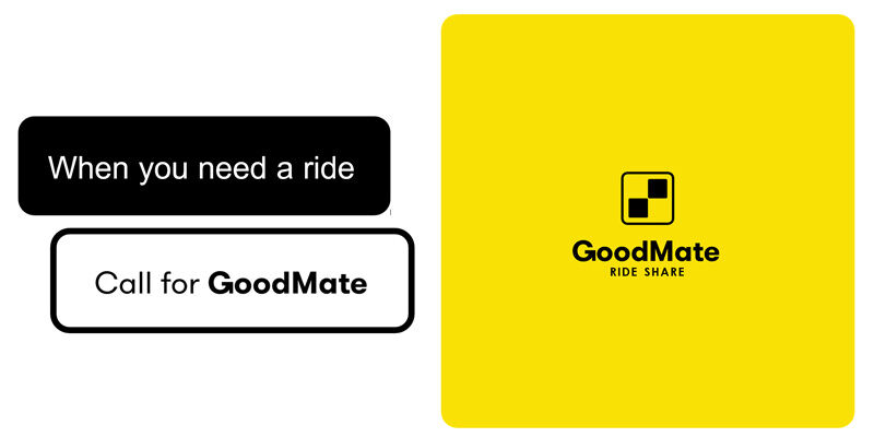
The geometric shapes used in the word mark and logo are easily recognized and assist with the brands legibility as well as the ability to leave an effective imprint on its audience. Had a different typestyle been selected then logo would be identifiable for different reasons, would have different characteristics and possibly evoke a different sentiment from its audience. The failure color pallet was essential to aligning the new brand with its intended audience and market space.
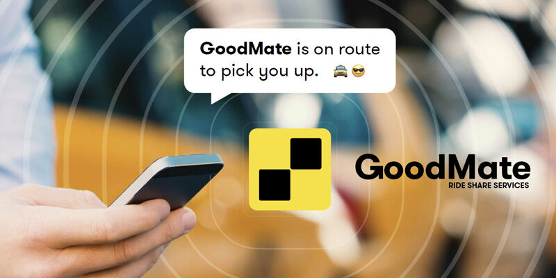
The initial questionnaire helped identify that users wanted a friendly and trustworthy rides hare service so the brand name was reflective of this, 'GoodMate' implies the company has friendly, dependable drivers and staff representing the company which is a characteristic that rise share users look for when choosing a service.
Design Exploration is a exercise where our graphic design team creates hypothetical clients and directives to explore new design concepts and creatives. We present the results as a recurring series on our blog and design site to showcase our team’s ideas, talent and capabilities.
Need design help for your next project?